
20 Living Room Color Schemes That Instantly Feel Elevated
A living room can have nice furniture, good lighting, and still feel flat. Most of the time, the missing piece is color. Not bold, trendy color that you’ll regret in a year, but a living room color scheme that feels layered, intentional, and grown-up.
The tricky part is knowing which colors to pair. Too many neutrals and the room looks washed out. Too many strong tones and nothing feels restful. The sweet spot is a scheme with a clear anchor color, one or two supporting tones, and a finish or texture that ties everything together.
This list covers 20 living room color schemes that skip the generic “gray everything” approach. Each one names the exact combination, tells you where to put it, and gives you a real starting point you can work with this weekend. Grab the ones that fit your space and save the rest for later.
1. Warm Ivory Walls with Rust Accents

Most people default to bright white walls and wonder why their living room feels cold. Warm ivory sits right between white and beige, and it reads clean without the clinical feel.
Pair it with rust-colored accents in small doses:
- A rust throw pillow on a neutral sofa
- A terracotta vase on a wood shelf
- A burnt sienna area rug with a low pile
The trick is keeping the rust to about 20% of the room. Any more and it starts to feel heavy. Stick with matte finishes on the accessories so nothing looks too polished or shiny.
2. Charcoal and Camel Leather Pairing

Dark gray walls can look moody and intentional, or they can look like a cave. The difference is what you put next to them. Camel-colored leather brings warmth back into the room without fighting the charcoal.
Think a camel leather armchair, a cognac-toned ottoman, or even a tan leather catchall tray on the coffee table. The leather develops a patina over time, which keeps things from looking too staged. I’ve tested this in a north-facing living room with limited natural light, and the camel leather kept the space from feeling gloomy even on overcast days.
Dark gray walls with black furniture and cool-toned pillows. Room feels flat and uninviting.
Same charcoal walls, but camel leather seating and warm wood accents. Room feels rich and grounded.
3. Sage Green with Warm Wood Tones

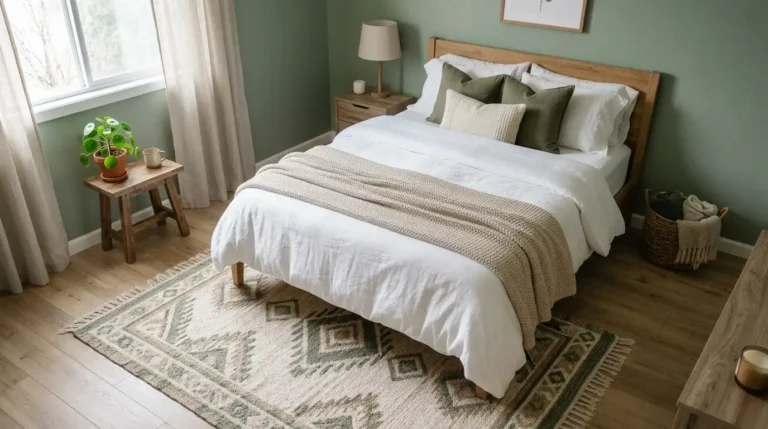
Start with a sage green wall, whether paint or peel-and-stick wallpaper if you’re renting. Then bring in warm wood tones through a walnut coffee table, oak floating shelves, or a rattan basket tucked beside the sofa.
Sage green works because it sits between gray and green, so it pairs with almost any wood tone without clashing. Keep your textiles in cream or oatmeal to let the green do the talking.
One thing to watch: avoid pairing sage with cool-toned metals like chrome. Brass or matte black hardware keeps the warmth consistent from wall to shelf.
4. Navy Blue and Brass Details

There’s a reason navy and brass keeps showing up in hotel lobbies and high-end restaurants. The combination reads expensive without trying hard. A deep navy accent wall behind the sofa, paired with brass picture frames, a brass floor lamp, and a gold-toned mirror, gives a living room that dressed-up quality.
You don’t need to go all-in on navy. Even navy throw pillows on a cream sofa with brass candlesticks on the mantle will get you there. The key is keeping the brass warm-toned, not bright shiny gold. Brushed or antique brass looks the most natural in a living room.
5. Dusty Rose and Olive Green Mix

People tend to think pink only works in bedrooms, but dusty rose in a living room is surprisingly grounding. It reads more like a warm neutral than a “pink room.” Pair it with olive green accents and the combination feels earthy, not sweet.
Here’s how to layer it without going overboard:
- Dusty rose on the walls or as a large area rug
- Olive green in the throw pillows, a blanket, or a potted plant
- Cream or warm white for the sofa and curtains
This scheme also works well when you’re carrying color between rooms. If you like neutral bedroom color palettes, dusty rose and olive bridge nicely into the hallway.
6. Warm White on White with Textured Layers

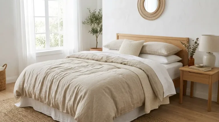
An all-white living room only looks boring when every surface has the same sheen and texture. The way to make it feel expensive is through layering: a chunky knit throw over a linen sofa, a jute rug under a smooth marble coffee table, linen curtains pooling slightly on the floor.
Stick with warm whites, not blue-whites. Benjamin Moore’s White Dove or Sherwin-Williams Alabaster are solid starting points. Then let the textures do the work. A bouclé accent chair, a woven basket for remotes, a ceramic table lamp with a matte glaze. Every piece should feel slightly different to the touch.
7. Terracotta and Cream Earth Palette

One rule that makes earth tone schemes work: pick one dominant warm color and let everything else stay quiet. Terracotta is the anchor here. Use it for a large piece like the sofa or an oversized floor vase, then surround it with cream walls, cream curtains, and a natural fiber rug.
Avoid mixing terracotta with other strong earth tones like mustard or burnt orange in the same room. It gets muddy fast. Cream gives the terracotta room to breathe. A few black accents, like a thin black picture frame or a matte black table leg, sharpen the whole palette without adding another color.
8. Midnight Blue and Mustard Pops

Saturday evening, the lamp is on, and the midnight blue walls in the living room glow like ink. That’s the mood this scheme creates. It’s bold but not loud.
Mustard is the counterweight. It stops the blue from becoming too serious. Use it sparingly: a mustard velvet cushion, a small accent table, or a throw folded over the arm of a sofa. Two or three mustard touches is plenty.
For the rest of the room, keep things neutral. A cream or oatmeal rug, natural wood side tables, and warm-toned lighting all ground the scheme. If you also love the idea of cozy bedroom ideas, this palette carries well into a bedroom with a lower wattage bulb and heavier textiles.
Use mustard in small, scattered doses: one cushion, one tray, one throw.
Keep the rest of the room in cream, warm white, or natural wood.
Don’t match a mustard sofa to blue walls. Too much contrast in large pieces looks jarring.
Avoid cool-toned grays here. They fight the warmth of both colors.
9. Soft Gray with Blush Pink Touches

Gray gets a bad reputation because people use too much of it. The fix is simple: pair a soft warm gray with blush pink accents so the room doesn’t feel like a waiting room.
A blush pink throw draped over a gray sofa, a small pink ceramic vase, or blush-toned curtains all work. The ratio matters more than the pieces. Keep pink to about 15% of the room so it reads as an accent, not a theme.
Choose a gray with warm undertones, not a blue-gray. Greige (gray-beige) is even better. It plays well with blush and keeps the whole space feeling soft without being washed out.
10. Forest Green Velvet with Gold

A forest green velvet sofa does about 80% of the work in this color scheme. It anchors the room, adds texture, and sets a moody, luxe tone all at once.
Gold accents finish the look. A gold-framed round mirror above the sofa, gold or brass legs on a side table, and a warm metallic pendant light overhead. Most people skip the lighting, but a warm-toned fixture is what pulls a green and gold room together.
I’ve seen this work best when the walls stay neutral. Warm white or a very light sage keeps the green sofa as the star. Dark green walls with a green sofa tends to swallow the room whole.
11. Clay and Stone Neutral Palette

Clay and stone might sound like the same color, but they sit on opposite sides of the neutral spectrum. Clay is warm and reddish. Stone is cool and gray-toned. Pairing them creates depth without adding any real color, which makes this scheme feel quietly sophisticated.
Compare the two approaches:
- All-warm neutrals (beige, tan, camel): cozy but can feel monotone
- Clay and stone mix (warm clay sofa + cool stone walls + natural linen): tension between warm and cool keeps the eye moving
Use clay for soft furnishings like upholstery and pillows. Use stone for hard surfaces like the walls, a concrete planter, or a stone-topped side table. The contrast is subtle but it’s what makes the room feel layered instead of flat.
| All-Warm Neutrals | Clay + Stone Mix |
|---|---|
| Beige, tan, camel tones | Warm clay paired with cool stone gray |
| Cozy but can feel one-note | Subtle tension creates visual depth |
| Works best with lots of texture | Works even with minimal styling |
12. Moody Plum and Warm Walnut

Paint one wall in a deep plum, something like Benjamin Moore Shadow or a similar muted purple-brown, and build from there. Plum reads darker and moodier than burgundy, which means it pairs well with rich walnut wood instead of competing with it.
Bring in walnut through a media console, a round side table, or a set of floating shelves. The warm brown grain of walnut softens the intensity of plum, so the room feels intimate without being dark.
For textiles, stick to cream, taupe, or soft gold. A plum room with too many dark fabrics becomes a black hole. Keep the sofa light and let the wall and wood do the heavy lifting.
13. Sandy Beige with Black Iron Accents

A sandy beige room can look expensive or it can look like a builder-grade apartment that never got decorated. The difference is contrast. Black iron gives beige walls a backbone.
Black iron curtain rods, a simple black metal bookshelf, or a wrought iron candle holder on the coffee table all add structure. The iron reads clean and modern, not heavy or industrial, when the rest of the room stays soft and sandy.
If you want the wall decor to carry the contrast, try a pair of black iron-framed prints. That same idea of hanging art above a focal point works in bedrooms too. Check out these above bed wall decor ideas for more ways to fill vertical space.
14. Pale Blue and Linen Neutrals

In my experience, pale blue is one of the most forgiving wall colors. It works in bright rooms and dim ones, with modern furniture and traditional pieces, and it never feels dated.
Layer in linen for the neutrals: a flax linen sofa, natural linen curtains, and a linen-covered lampshade. Linen’s slightly rumpled texture keeps the pale blue from looking too polished or too cold.
A jute or sisal rug adds another layer of warmth underfoot. If you’re not sure what size works best, how to choose the right rug size has visual guides that apply to living rooms just as well.
💡 Quick Tip
Test pale blue paint swatches at three times of day. Blues shift dramatically between morning sun, flat midday light, and evening lamplight. Tape two or three swatches to the wall and check back at 8 AM, noon, and 7 PM before committing.
15. Warm Chocolate Brown and Cream

Chocolate brown got pushed aside during the gray trend of the 2010s, but it’s coming back with good reason. A warm chocolate brown sofa or accent wall paired with cream creates a cozy living room that feels intentional and put-together.
The key to keeping it fresh is texture variety. A chocolate velvet sofa, a cream wool throw, a woven rattan chair, and a ceramic cream lamp all hit different materials while staying in the same two-tone palette. When you layer the textures, the simple color scheme never feels boring.
Avoid matching browns too closely. Let the sofa be dark chocolate, the rug a lighter mocha, and the wood furniture something in between. Slight variation keeps it alive.
16. Muted Teal and Burnt Orange Duo

Here’s a simple rule for anyone nervous about using two bold colors: keep both of them muted. A muted teal and a muted burnt orange sit across from each other on the color wheel, which creates natural tension and energy. But because both tones are softened, the room feels collected, not chaotic.
Use teal on the larger pieces (an accent wall, the curtains, or the sofa) and burnt orange on smaller accents (a throw, a few pillow covers, a small side table). That keeps the balance right.
Teal curtains with a nice weave also help with light control. If you’re particular about blocking light in other rooms, these blackout curtains for better sleep are worth a look.
Choose your dominant color (teal for calm, orange for energy) and assign it to the biggest piece.
Use the second color in two to three small accents scattered across the room.
Fill the rest with warm neutrals: cream, oatmeal, or light warm gray to keep the room from competing with itself.
17. Greige Walls with Cognac Leather

Greige, that halfway point between gray and beige, is one of the easiest wall colors to live with. It doesn’t lean too warm or too cool, which makes it a strong base for almost any accent.
Cognac leather is the best companion for greige walls. A cognac leather sofa, a pair of leather dining chairs pulled up to a console table, or even a leather-wrapped tray on the ottoman all bring warmth without adding another color to manage.
Most people who try this scheme are surprised how little else the room needs. A few plants, a textured throw, and a good lamp are usually enough. When the base is this balanced, less really does look like more.
18. Soft Lavender and Warm Gray

It’s early morning and the living room catches the first light through sheer curtains. The soft lavender walls glow, and the warm gray sofa looks like it was made for this exact color. That’s the draw of this palette: it has personality but never screams.
Lavender works in a living room when you keep it muted and pair it with warm, not cool, grays. Cool grays make lavender look icy. Warm grays (those with brown or taupe undertones) make it feel calming and modern.
Add natural textures to keep it from feeling too airy. A chunky wool throw, a woven basket, or a wood side table with visible grain all anchor the softness with something solid.
19. Olive and Mushroom Earth Tones

A lot of people pile on earth tones and end up with a room that looks like a bag of trail mix. The mistake is using too many warm earth colors at once. Olive and mushroom work because one is green-based and one is gray-based, which creates contrast within the earthy family.
Use olive on the walls or in the upholstery. Use mushroom for the rug, the curtains, or the throw pillows. The two tones look like they belong together without blending into one murky shade.
Black accents help here. A black-framed mirror, a matte black table lamp, or a dark shelf bracket gives the palette something crisp to lean against.
20. Creamy Caramel and Crisp White

Side by side, caramel and white don’t sound like much. But when you layer them in a room, the combination feels clean, warm, and deliberate. This is the scheme to use when you want a living room that looks pulled together without picking a “bold” color.
Start with crisp white walls and white trim. Bring in caramel through a leather sofa, a caramel-toned wood console, or a woven jute rug with golden undertones. Add one or two touches of matte black or iron for sharpness.
The result looks like a room from a design magazine, but nothing in it is hard to find or expensive to buy. That’s the beauty of a two-tone scheme where both tones are naturals.
A two-tone living room color scheme works best when one tone is warm and the other is neutral. Let the warm one carry the personality, and let the neutral one give it space to land.
Wrapping Up
Choosing a living room color scheme doesn’t need to mean a full renovation. Start with one combination from this list, test a paint swatch or swap a few accent pieces, and see how the room feels after a week. The best color schemes are the ones you actually enjoy living in, not just the ones that photograph well.
If something here caught your eye, save this list for the next time you’re ready to refresh your space. One good color pairing can change the entire mood of a room.