18 Neutral Bedroom Color Palettes for a Calm, Warm Aesthetic
Neutral bedroom color palettes get a bad reputation for being boring, but the truth is, most bedrooms that actually feel restful use neutrals as their foundation. The tricky part is choosing the right combination. Pick the wrong beige and your room looks flat. Go too cool with your grays and the whole space feels sterile.
The fix is not adding more color. It is finding neutrals with the right undertones and pairing them with enough texture to keep things interesting. A warm taupe next to crisp white linen reads completely different than that same taupe against a yellow cream wall.
These 18 neutral bedroom color palettes are built around real combinations that work, with enough range to fit bedrooms that lean modern, cozy, rustic, or somewhere in between. Each one names specific tones so you can shop paint swatches and bedding with a clear direction.
1. Warm White Walls With Oatmeal Linen Bedding
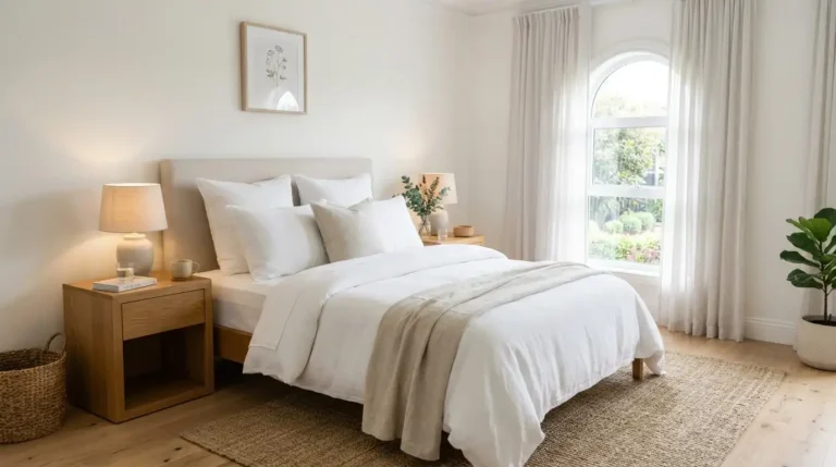
A bedroom that leans too white can feel cold and clinical. Warm white walls (think Benjamin Moore White Dove or Sherwin Williams Alabaster) solve that by adding just enough yellow undertone to soften the room without feeling dated.
Pair them with oatmeal linen bedding and the whole room relaxes. The linen brings visible texture that keeps the palette from reading flat.
What pulls it together:
The oak wood warms the palette one more notch, and the grain adds visual interest you cannot get from another shade of white.
2. Greige Walls With Ivory and Walnut
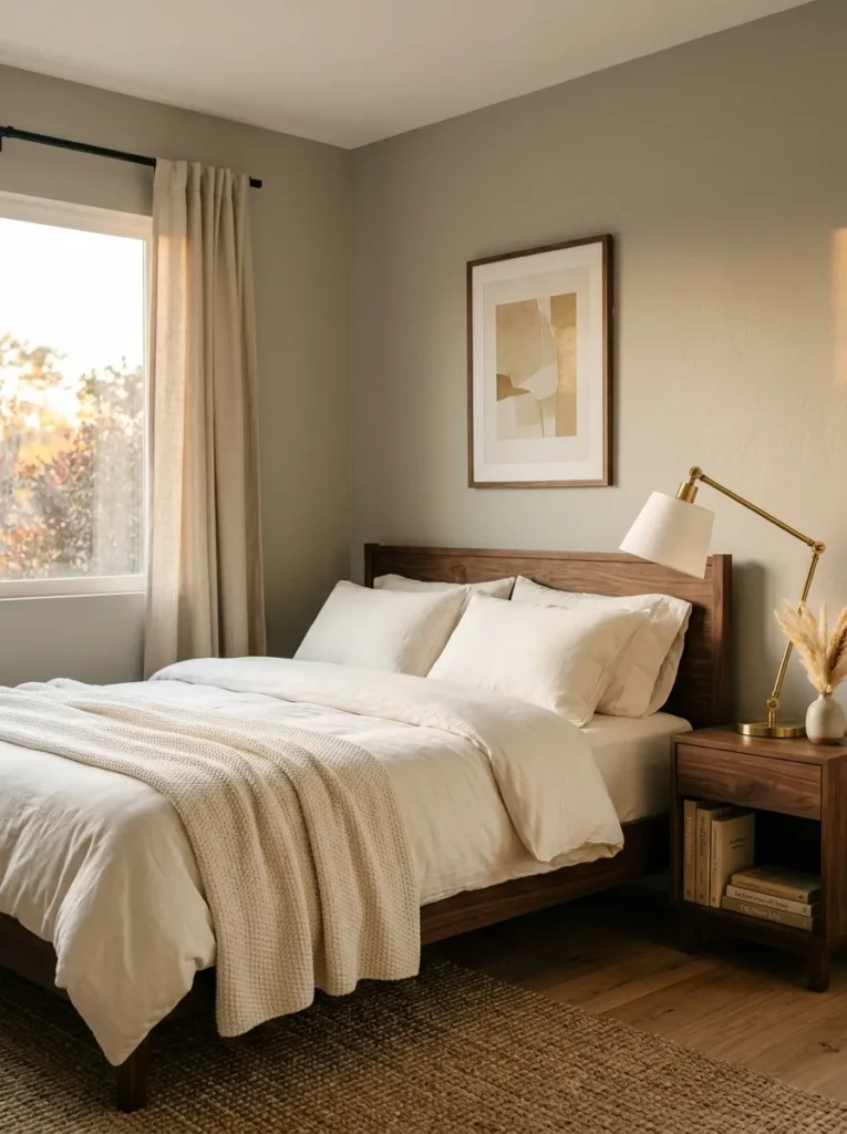
Greige sits right between gray and beige, and that is exactly why it works so well in bedrooms. It reads modern without going cold, and warm without tipping into yellow. Most paint brands carry a version now. Sherwin Williams Agreeable Gray is one of the most popular for a reason.
Layer in ivory bedding and a dark walnut bed frame, and you get contrast without any bold color. The walnut grounds the room and keeps the lighter tones from floating.
💡 Quick Tip
Test greige swatches in your bedroom at night under your actual lighting. Greige can shift cooler under LED bulbs and warmer under incandescent, so what looked right at the store might surprise you at home.
I have seen this palette in at least a dozen homes at this point, and it always reads more expensive than it costs.
3. Mushroom, Cream, and Aged Brass
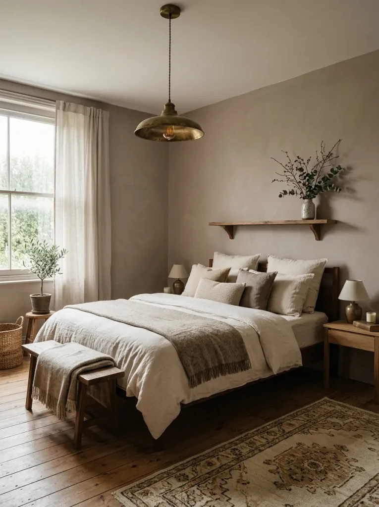
Mushroom is one of those colors people scroll past because the name sounds dull, but on a wall it looks rich and layered. It has a soft brown base with a slight gray cast that changes depending on the light. Morning sun makes it look warm and rosy. Overcast days push it toward stone.
Cream bedding keeps it from feeling heavy, and aged brass hardware on the nightstand or a pendant light adds just enough warmth to tie the palette together without anything shiny or cold.
Mushroom walls look rosy and warm in morning sunlight, then shift to cool stone gray on cloudy afternoons.
That shifting quality means the room never feels static. It reads differently at 7 a.m. than at 9 p.m., which gives one paint color a lot of range.
4. Charcoal Accent Wall With Warm Linen Layers
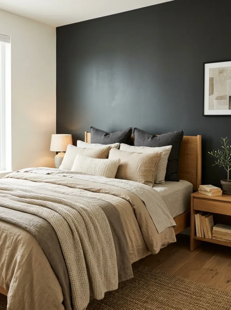
Most neutral bedrooms stay light everywhere, and that is fine, but a single charcoal wall behind the headboard adds anchoring depth that light palettes cannot achieve on their own. The key is picking a charcoal with brown or green undertones rather than blue ones.
Keep the remaining three walls in a soft off-white. Then pile on warm linen bedding in tones like flax, sand, and natural cream. The contrast is dramatic enough to feel intentional but still quiet and restful at the end of the day.
Charcoal accent wall checklist
5. Sandy Beige With Terracotta Undertones
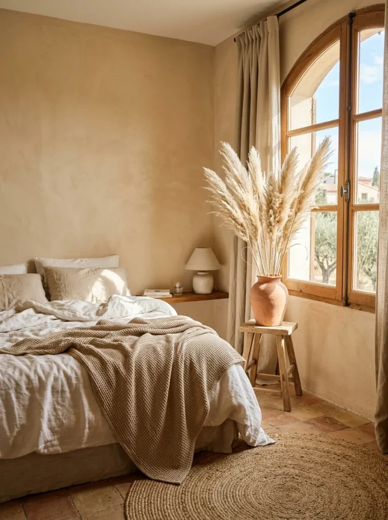
Plain beige walls disappeared from design blogs for years, but sandy beige with terracotta undertones is a different animal entirely. It brings a sun-baked warmth that feels like a Mediterranean afternoon, and it pairs naturally with raw wood, dried botanicals, and woven textures.
Skip the shiny polyester bedding here. This palette wants natural fibers. Think cotton waffle throws, jute rugs beside the bed, and unfinished clay pots on the nightstand. The whole point is that nothing looks too polished.
Sandy beige with terracotta undertones only works when every texture in the room is natural. The second you add anything glossy or synthetic, the warmth falls flat.
6. Pale Stone Gray With Blush Undertone
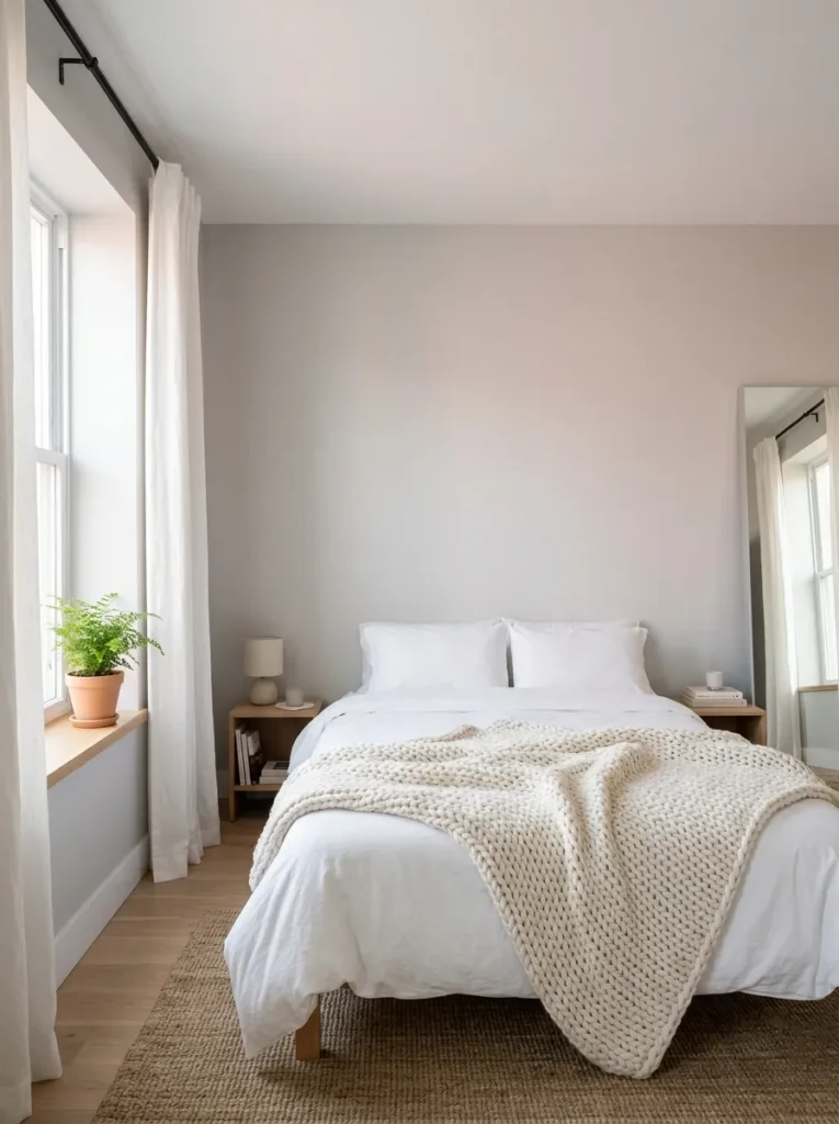
Gray bedrooms get a bad rap for feeling sterile. The fix is choosing a gray that has a blush undertone sitting underneath it. On the wall it reads like a soft stone that catches a little warmth, not like a concrete parking garage.
This palette works best with white linen curtains that let light diffuse, a chunky knit throw in off-white, and matte black hardware for just enough edge. The blush undertone does the heavy lifting, so you do not need pink pillows or anything overtly rosy.
Pick a gray swatch that looks faintly pink in bright daylight.
Pair it with white and off-white textures, not more gray.
Avoid cool blue-gray tones that read clinical under bedroom lighting.
Do not match gray walls with a gray duvet. It flattens the room.
7. All-White Bedroom With Layered Textures
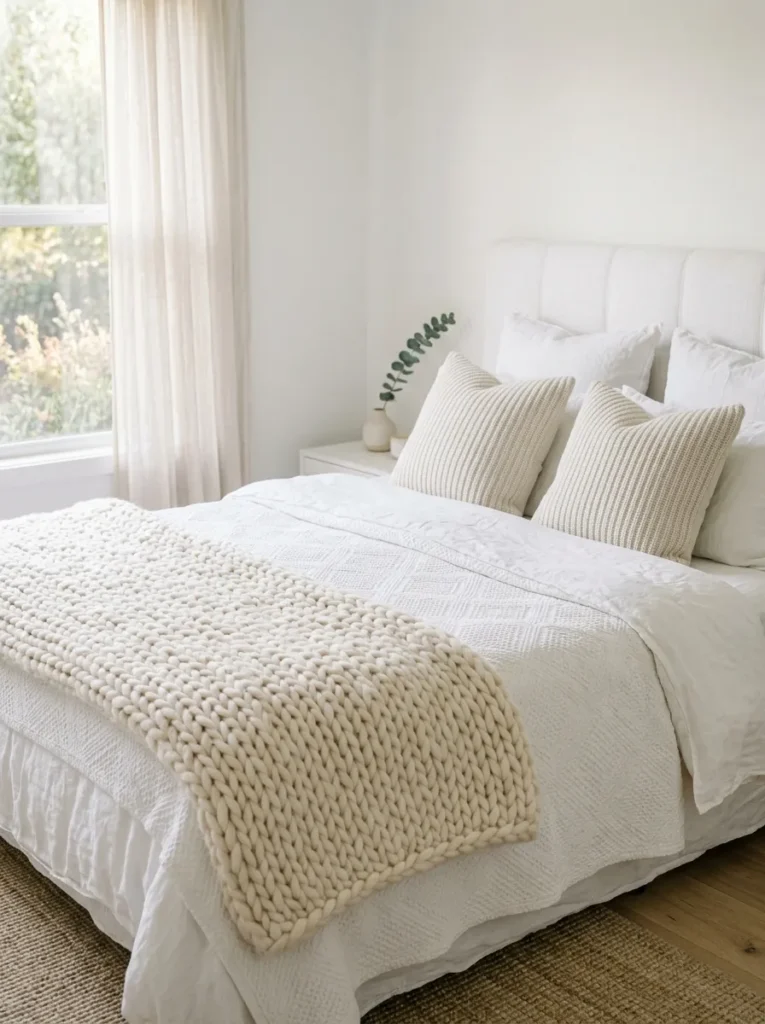
An all-white bedroom sounds like it should be simple, but most of them end up looking like a hotel room or a blank canvas. The difference between boring white and intentional white comes down entirely to texture. You need at least three or four different fabric textures in the room to pull it off.
Think linen sheets, a cotton matelasse coverlet, a chunky wool throw at the foot of the bed, and ribbed knit pillow covers. Each white is slightly different, and that variation is what makes the room feel lived in rather than staged.
Start with linen sheets as your base layer for subtle wrinkle texture.
Add a cotton matelasse or waffle-weave coverlet for a second visible texture.
Fold a chunky knit or wool throw at the foot of the bed.
Mix in one or two ribbed knit pillow covers for the final contrast.
I have tried this in a small apartment bedroom where every wall was builder-grade white. The texture layers made it feel designed, not default.
8. Warm Taupe With Black Iron Details
Taupe lands right in the sweet spot between brown and gray, and when you add black iron accents, the palette develops a quiet strength that reads modern farmhouse or industrial without leaning too far into either trend.
A matte black iron bed frame, a slim black table lamp, or black curtain rods are enough to create that contrast. You do not need a lot of black. Just enough to give the soft taupe something to push against.
📌 Good To Know
Caramel leather deepens over time with sunlight and wear, which actually helps this palette. A year-old leather headboard blends better with putty walls than a brand new one. If yours is new, give it time.
If you are renting and cannot paint, taupe bedding with black iron accessories on white walls gets you close to the same effect.
9. Soft Putty Walls With Caramel Leather

Putty is one of the most underused neutrals in bedrooms. It sits between beige and gray, leaning slightly warm, and it pairs naturally with brown leather in a way that gray walls never quite manage. A caramel leather headboard or a leather-strapped bench at the foot of the bed brings a richness that feels collected, not decorated.
Keep the rest simple. White sheets, a light wool blanket, and a few stacked hardcovers on the nightstand. The leather is doing the work, so let it.
📌 Good To Know
Caramel leather deepens over time with sunlight and wear, which actually helps this palette. A year-old leather headboard blends better with putty walls than a brand new one. If yours is new, give it time.
10. Barely-There Pink With Warm Wood Floors
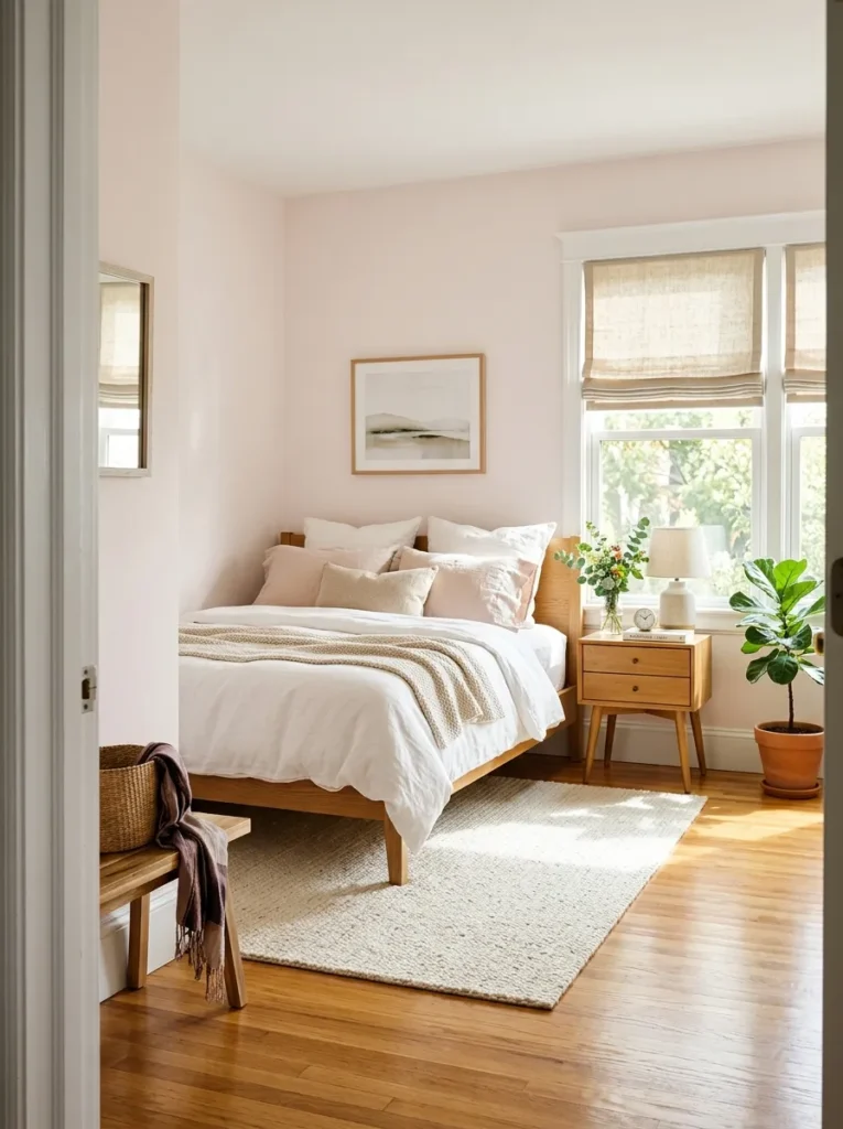
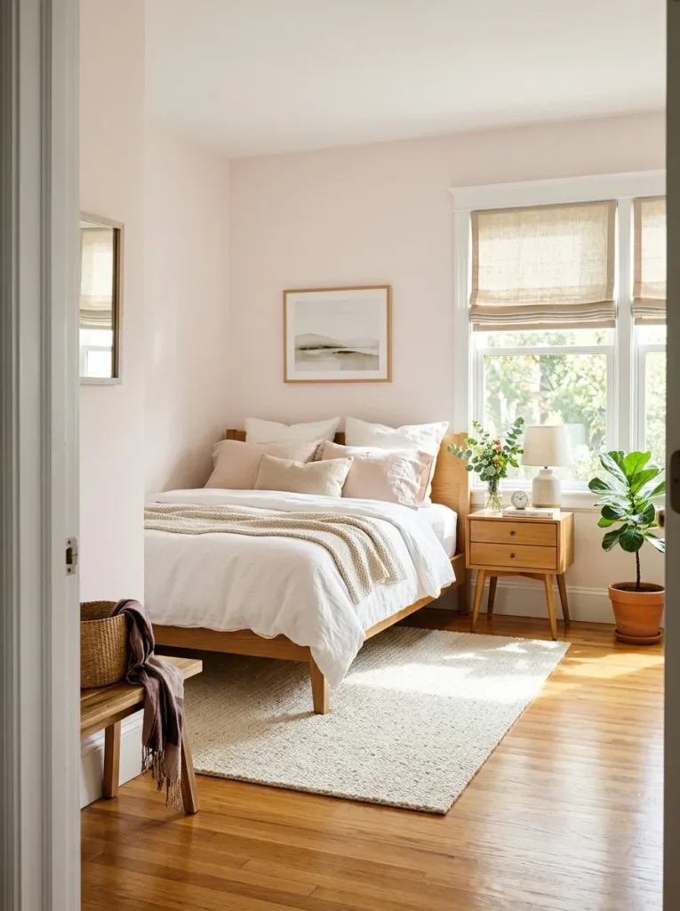
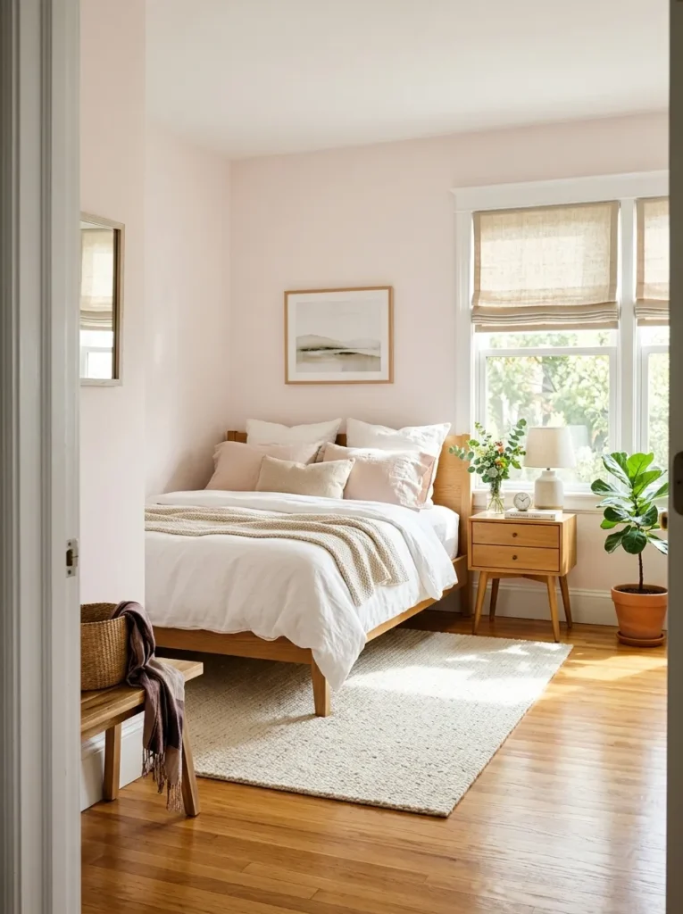
Most people who say they hate pink in bedrooms are thinking of bubblegum or millennial blush. A barely-there pink is a completely different color. It reads almost white on the wall, but next to a true white ceiling, you can see the faintest warmth coming through. It makes skin tones look good and rooms feel welcoming.
Warm wood floors in honey or medium oak keep it grounded. Without the wood, a faint pink room can feel too sweet. With it, the palette feels grown-up and settled. Add natural linen Roman shades and a simple cream rug.
11. Fog Gray With Natural Linen and Driftwood
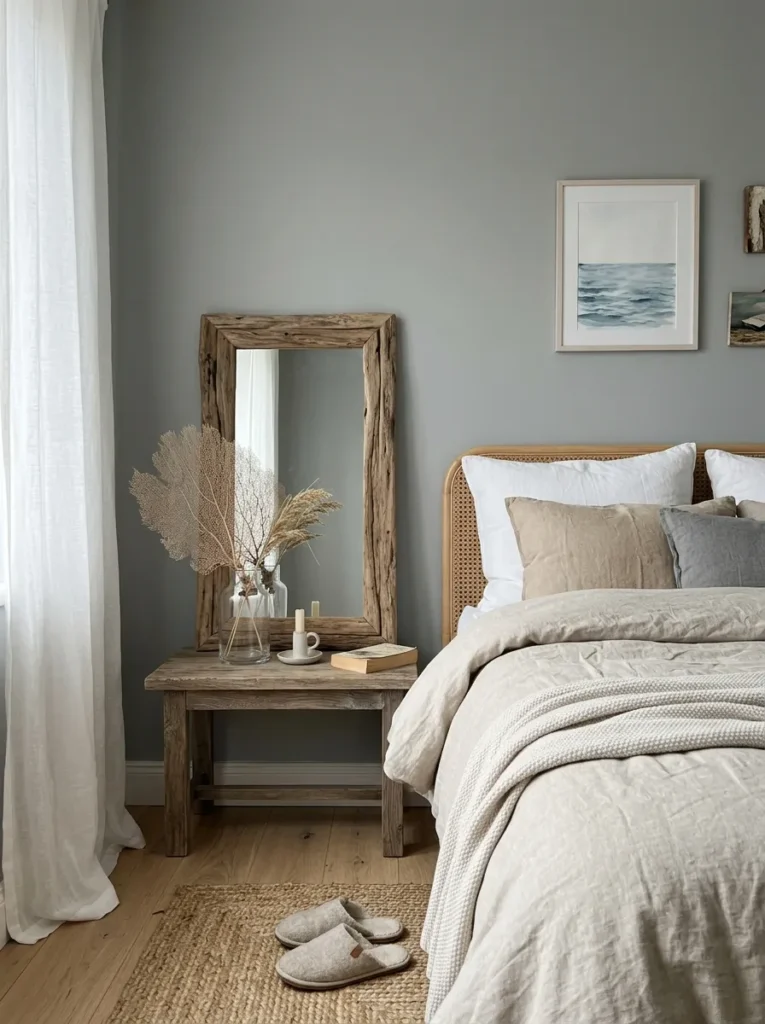
Fog gray has a blue-green whisper behind it that separates it from standard gray. Paired with natural undyed linen and a piece of driftwood or weathered wood furniture, this palette brings a coastal calm to bedrooms without the cliche navy-and-white nautical look.
A washed linen duvet in its natural flax color is the anchor here. Add a small driftwood mirror or a reclaimed wood shelf above the bed, and the whole room starts to feel like a quiet morning by the water. This palette works especially well if your bedroom gets good natural light. You can find more ideas for calm, nature-inspired rooms in our guide to earthy living room color schemes.
12. Deep Espresso With Cream and Woven Rattan

Going dark in a bedroom takes nerve, but deep espresso walls create a cocoon effect that lighter palettes simply cannot match. The room wraps around you. It feels enclosed, private, and deeply restful.
Balance is everything here. You need cream bedding to break up the dark walls, and woven rattan accents bring the lightness and texture that keep the room from feeling like a cave. A rattan pendant light or a rattan-framed mirror on the espresso wall creates a focal point that draws the eye.
I have tried dark wall colors in bedrooms under 12 by 12 feet and they still worked. The trick is good lighting and enough contrast in the bedding.
13. Warm Concrete Gray With Olive Undertone
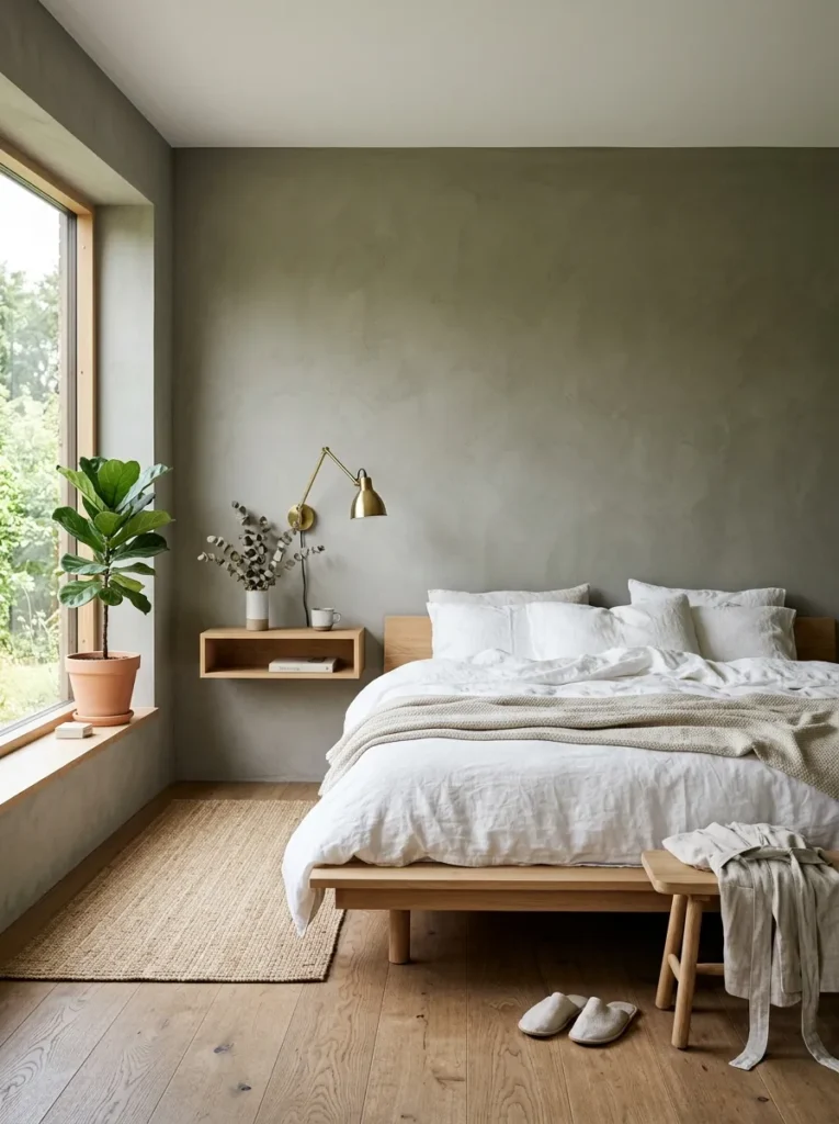
Standard concrete gray in a bedroom usually reads industrial and cold. But concrete gray with a slight olive undertone warms up the entire palette. It sits somewhere between gray and sage, and it pairs beautifully with warm brass fixtures and natural linen.
This is a palette that works well in bedrooms with minimal furniture. A platform bed, one nightstand, a brass reading lamp, and not much else. The color does the talking. Too many accessories distract from it.
14. Cafe Au Lait Walls With Chocolate and Cream
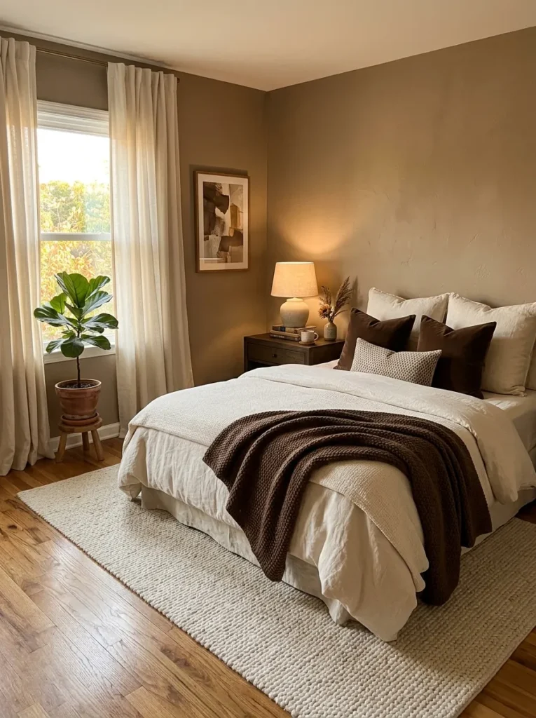
This tonal palette layers three depths of the same color family: cafe au lait on the walls, chocolate brown in a throw or accent pillow, and cream in the sheets and curtains. The result is rich and layered without any competing colors pulling your eye.
It works particularly well in bedrooms with carpet, because the soft flooring reinforces the cozy, tonal feel. If you have hardwood, a large cream area rug under the bed bridges the gap. For more ideas on styling warm, tonal rooms, take a look at our post on cozy bedroom decor ideas for every budget.
15. Parchment Walls With Soft Black Accents
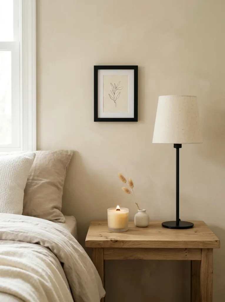
Parchment is warmer than white but cooler than cream, and it has a slightly yellow-gray quality that feels old-world and collected. Most people overlook it because it does not show up well on a small paint chip. On a full wall, it is beautiful.
Pair it with soft black accents. Not shiny, glossy black, but matte or washed black in the form of a lamp base, a picture frame, or thin-profile curtain rods. The black-on-parchment contrast reads like ink on old paper. Quiet, grounded, and sophisticated without trying.
16. Almond, Wheat, and Burnished Gold
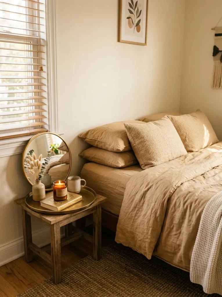
This palette skews warm and golden without ever touching orange. Almond walls set a soft, slightly pink-beige base. Wheat-toned bedding in a heavier cotton or linen brings a harvest-field warmth. Then burnished gold hardware, a brass-rimmed mirror, or a single gold-frame print on the wall gives the room a quiet glow.
The trick is restraint with the gold. One or two small pieces are enough. More than that and the room starts to feel like it is trying too hard. A small burnished gold tray on the nightstand holding a candle and a ring dish is all you need.
17. Bone White With Raw Wood and Black Linen
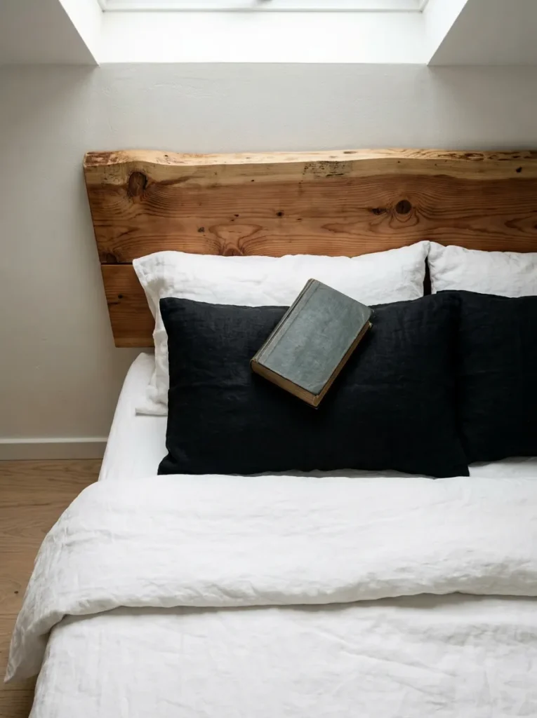
Bone white sits slightly warmer than pure white but cooler than cream, and it has a muted, organic quality. Pair it with a raw-edge wood headboard or floating shelves in unfinished pine, and you get a Scandinavian-meets-Japanese simplicity that is hard to replicate with busier palettes.
The unexpected element here is black linen. A set of black linen pillowcases or a black linen throw draped over the foot of the bed gives the palette a sharpness that keeps it from reading as soft and forgettable. Most people skip black in a bedroom because they think it is harsh, but in linen, it is anything but. If you are building a minimalist bedroom from scratch, our post on [small bedroom furniture arrangement tips can help you plan the layout.
18. Warm Clay, Dried Sage, and Soft Ivory
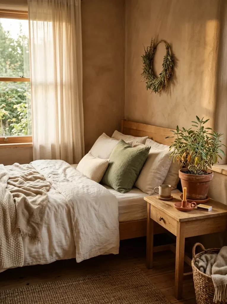
This trio is the most nature-rooted palette on the list, and it is where neutrals start to blur into earthy color territory in the best possible way. Warm clay on the walls brings a muted, sun-dried warmth. Dried sage shows up in a linen throw pillow or a small potted plant. Soft ivory grounds everything in the bedding and curtains.
The beauty of this combination is that it looks different in every season. Summer light makes the clay feel sandy and open. Winter light pushes it toward terracotta and cocoa. It is one of those palettes that genuinely shifts with the year, so you never get tired of it. For more seasonal-friendly palettes, check out warm fall decor ideas for your bedroom.
Your Next Move
Neutral bedroom color palettes work hardest when every piece in the room shares the same warmth or coolness. Pick one palette from this list that matches your gut feeling about the room, then start with one element. A new duvet cover, a paint swatch on the wall, or a single throw pillow in the right tone. You do not have to overhaul everything at once.
The rooms that feel the most peaceful are usually the ones where someone made a few careful choices and left room to breathe. Save this list for the next time you are ready to rethink your bedroom colors, and start with the palette that made you pause.